Responsive Web Design: Best Practices for 2025
In an era where the digital landscape is rapidly evolving, having a website that performs well on all devices is no longer a luxury; it’s a necessity. The growth of mobile internet usage means that more users access websites through smartphones and tablets than ever before. As a result, responsive web design has become crucial for businesses and developers aiming to provide an optimal user experience across various platforms. This article delves into the best practices for responsive web design in 2025, equipping you with the knowledge to create websites that not only look great but also perform flawlessly on any device.
What Is Responsive Web Design?
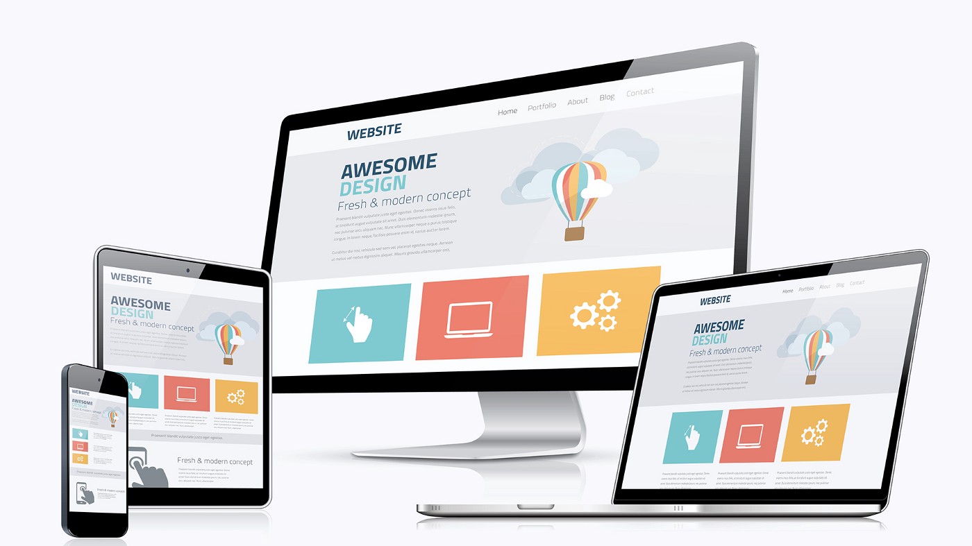
Responsive web design (RWD) is an approach that ensures web pages automatically adjust their layout, images, and overall appearance to fit the screen of the device being used. This adaptability enhances user experience by making sure that content is accessible and easy to navigate, regardless of whether it's viewed on a desktop, tablet, or smartphone.
The Importance of Responsive Web Design
As we approach 2025, it’s essential to grasp why responsive design is pivotal for your online presence:
Mobile Traffic Surge: According to Statista, mobile devices accounted for over 50% of global website traffic in 2023. This trend is only expected to grow. Websites that aren't optimized for mobile will miss out on significant potential traffic.
SEO Benefits: Google uses mobile-first indexing, meaning that the mobile version of your site is prioritized when ranking search results. A responsive design can positively impact your search engine optimization (SEO) efforts.
Improved User Experience: A responsive site reduces the need for users to zoom in and scroll horizontally, which can frustrate visitors and lead to high bounce rates. Websites that offer a seamless user experience encourage longer visits and higher interaction rates.
Cost-Effectiveness: Maintaining one responsive site is more cost-effective than managing separate desktop and mobile sites, both in terms of development and ongoing updates.
Best Practices for Responsive Web Design in 2025
1. Mobile-First Approach
Starting with a mobile-first design means designing for the smallest screen first, then progressively enhancing the design for larger screens. This technique encourages developers to prioritize essential elements and create more streamlined content. Google emphasizes this practice, indicating that starting with mobile should be the cornerstone of your strategy.
2. Fluid Grid Layouts
Using fluid grids instead of fixed layouts allows your design to adapt to different screen sizes. Fluid grids use relative units like percentages instead of fixed units like pixels to define widths. This ensures that your website's layout will automatically resize in accordance with the viewer’s screen size.
3. Flexible Media
When it comes to images and videos, using flexible media will enhance the responsiveness of your site. By using CSS techniques such as max-width: 100%;, images scale nicely to the container they are in, keeping them responsive without losing quality or causing content overflow.
4. Media Queries
CSS Media Queries are a cornerstone of responsive web design. These queries allow you to apply styles based on the device’s characteristics, such as screen width, orientation, resolution, etc. In 2025, it's crucial to leverage media queries to provide unique experiences to different devices. For example:

This code changes the background color on screens smaller than 600 pixels.
5. Prioritize Content
As a best practice, it's essential to prioritize content according to importance. This means placing essential information where it is most visible to the users, especially on smaller screens. Avoid overwhelming users with lots of text or graphics on mobile; instead, focus on concise messaging that gets your point across quickly.
6. Touch-Friendly Design
With the prevalence of touchscreen devices, optimizing for touch is essential. Ensure buttons, links, and other interactive elements are large enough for users to tap comfortably. The recommended touch target size is at least 44x44 pixels.
7. Fast Load Times
In our fast-paced digital environment, a slow-loading website can be detrimental. According to Google, 53% of mobile site visitors leave if a page takes longer than three seconds to load. To optimize load times:
- Minimize HTTP requests.
- Optimize images.
- Use asynchronous loading for CSS and JavaScript.
- Leverage browser caching.
8. Optimize Typography
Responsive typography also plays a pivotal role in overall design and usability. Use relative units such as em or rem instead of pixels for font sizes. This allows your text to scale more effectively across different devices. CSS viewport units (vw/vh) can also be used to create scalable text that adjusts to the screen size.
9. Test Across Multiple Devices
One of the most critical aspects of responsive design is testing. Regular checks on various devices and browsers help identify discrepancies and improve user experience. Utilize tools like BrowserStack to test your website's performance across different environments.
10. Utilize Responsive Frameworks
Frameworks like Bootstrap and Foundation provide grid systems and components that simplify the responsive design process. They offer pre-built CSS and JavaScript components that help create consistent layouts across devices, allowing for faster development times.
Tools to Enhance Responsive Web Design
1. Adobe XD
Adobe XD is a powerful design and prototyping tool that allows designers to create responsive web layouts and user experiences. With features like artboards and responsive resize, Adobe XD helps streamline the design process.
2. Figma
Like Adobe XD, Figma is a collaborative design tool that allows multiple users to work on a project in real-time. It offers powerful prototyping capabilities and is an excellent resource for creating responsive designs.
3. Google Mobile-Friendly Test
Use the Google Mobile-Friendly Test to analyze how well your web page performs on mobile devices. This free tool helps identify areas for improvement in your responsive design.
4. Responsinator
Responsinator is a tool designed to show how your website appears on various devices in real-time. This can help identify layout issues and areas needing adjustment.
The Future of Responsive Web Design
As we step into 2025, the focus on responsive web design will only intensify. Here are some trends to keep an eye on:
1. AI-Driven Design
Artificial Intelligence (AI) is poised to revolutionize web design by offering personalized user experiences and automating routine tasks. Tools powered by AI can analyze user behavior and optimize layouts, content, and ads to improve engagement.
2. Progressive Web Apps (PWAs)
PWAs combine the best of web and mobile apps, offering offline capabilities and improved loading performance. As PWAs continue to gain traction, understanding their responsive principles will become increasingly important.
3. Voice User Interface (VUI)
With voice search on the rise, integrating VUI into responsive web design will be vital. Designing for voice commands involves simplifying website navigation and ensuring content is easily accessible via voice search.
4. Enhanced Interactivity and Animation
As technology advances, incorporating more interactive elements and animations into responsive design will attract user engagement. Proper use of animations can enhance user experience while still maintaining fast loading speeds.
Conclusion
Responsive web design is more important than ever as we enter 2025. By adhering to best practices such as mobile-first design, fluid grids, and regular testing, you can create websites that deliver exceptional user experiences across any device. Embrace the latest tools and trends in responsive design to maintain a competitive edge in the digital landscape. As you build your projects, remember that a well-designed website is not just about aesthetics; it’s about creating meaningful connections with your audience.
If you found this content useful, please do well to share:
Blog Search
Latest Posts

Unlock Your Tech Future: Seize a 30% Discount on Professional Tech Courses at Madros Technologies!
September 6, 2025Ready for a career change? Madros Technologies offers 30% OFF expert-led tech training. Master in-demand skills like Software Engineering, Digital Marketing, Da

Quick Window Offer: Extended August Discount Offer – Your Tech Dreams, 40% Off!
August 12, 2025Transform your future with 40% off Madros Technologies courses! Gain job-ready skills in coding, design, and digital marketing fields. This is an extended disco

Your Tech Dream: Closer Than You Think (And Half Off!)
July 5, 2025Unlock your tech potential with Madros Technologies! Get 50% off cutting-edge courses & transform your future. Your dream career starts here.

Using Figma: Tutorial for Beginner Product Designers
June 7, 2025A beginner’s walkthrough of Figma for prototyping and design collaboration

Top 5 Video Editing Software for Beginners
June 7, 2025Discover the best tools for newbie editors to create stunning videos easily

How to Design User-Friendly Mobile App Interfaces
June 7, 2025Basic UI/UX principles every newbie should apply when creating mobile apps
